Project Type
- Branding
- VI Design
Tools
- Illustrator
- Photoshop
The 5 o’clock Cafe is a laid-back coffee shop that provides a warm and cozy setting for those looking to relax after work, or to simply energize themselves at any time throughout the day.
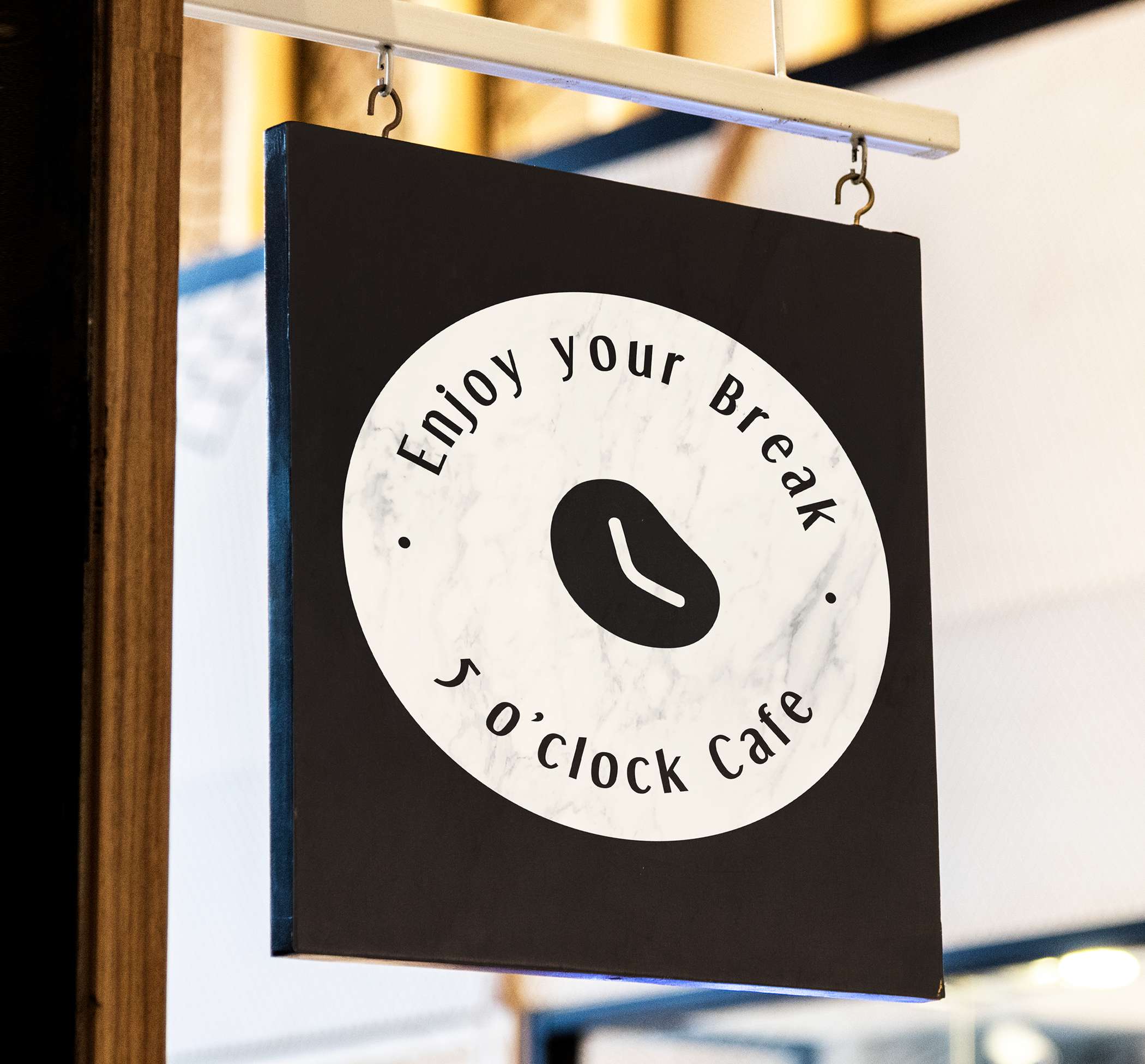
My branding and design goals for 5 o’clock Cafe focused on expressing the joy of sharing delightful conversation over delicious food and drinks with friends. The tagline for the shop is “Enjoy your Break”, and the whole project revolved around this relaxed theme by utilizing visual deliveries.
Statistics show that in Canada, 59% of adults under 35 believe that a barista-prepared beverage adds value to their purchase, therefore my target demographic for 5 o’clock Cafe are adults between 25-35 that enjoy coffee both for energy or for pleasure.
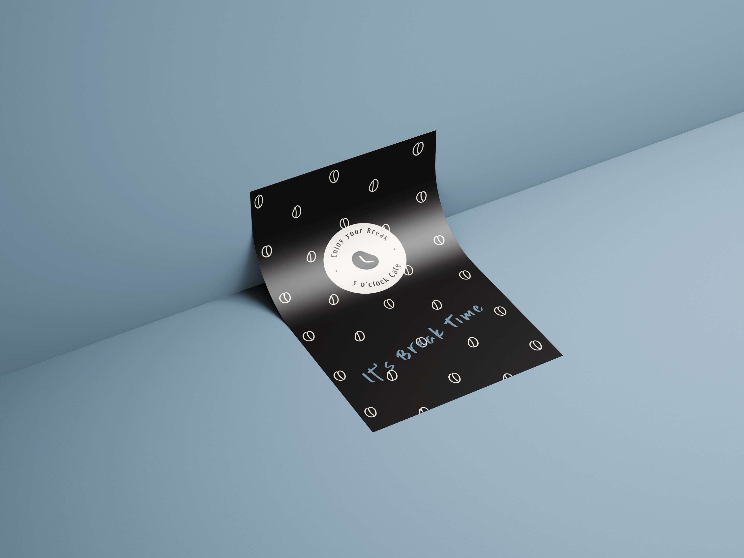
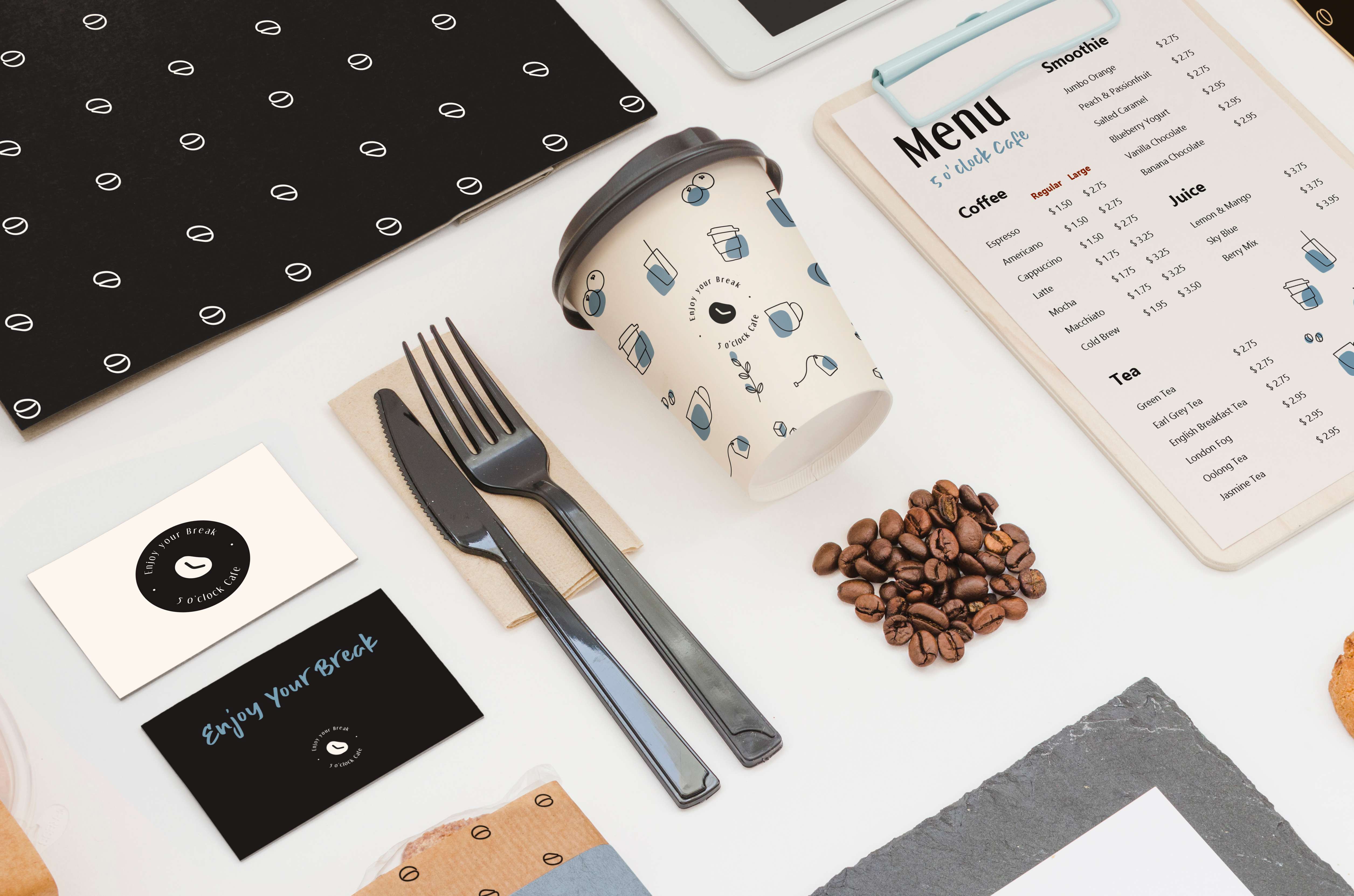
The two main color palettes I chose for the shop was Bokara Gray and Linen White. I felt the simplicity and dark hue of Bokara Gray represented the coffee, while the brightness and silent sheen of linen white represented the milk. The secondary color used was Bali Hai Blue, which emphasized the efficacy of a friendly and easygoing environment.
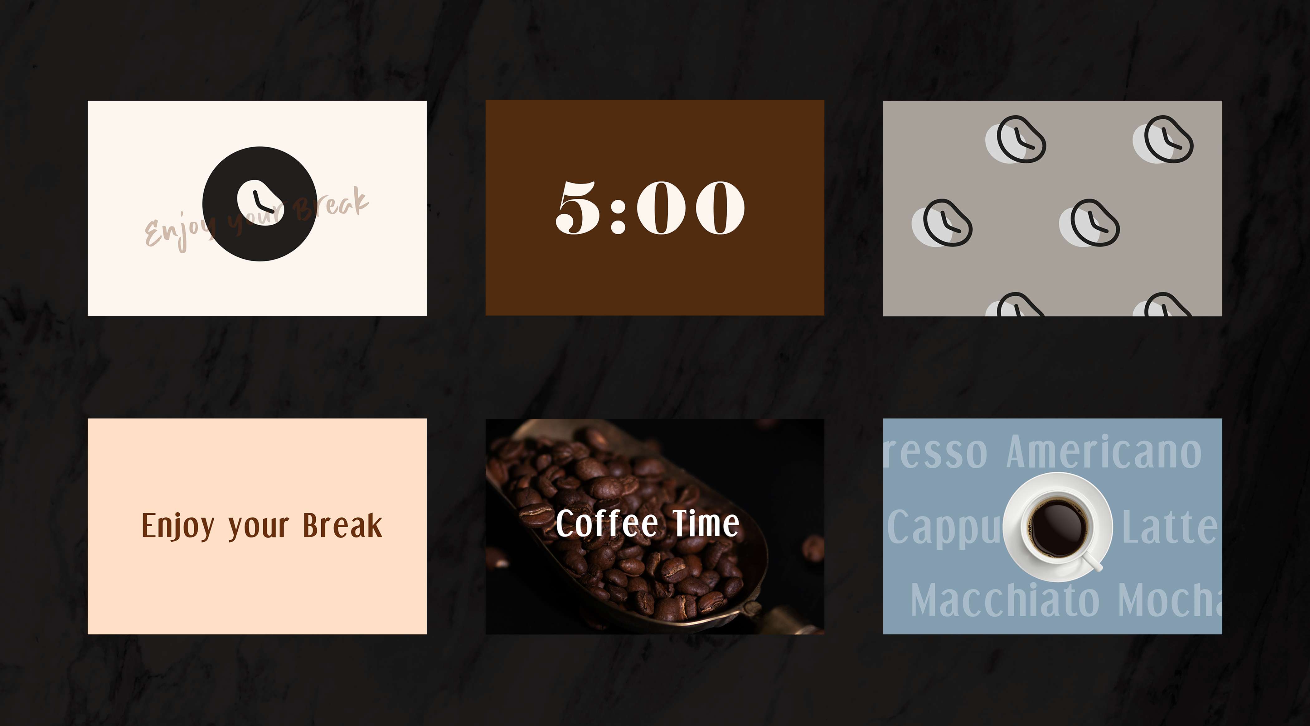
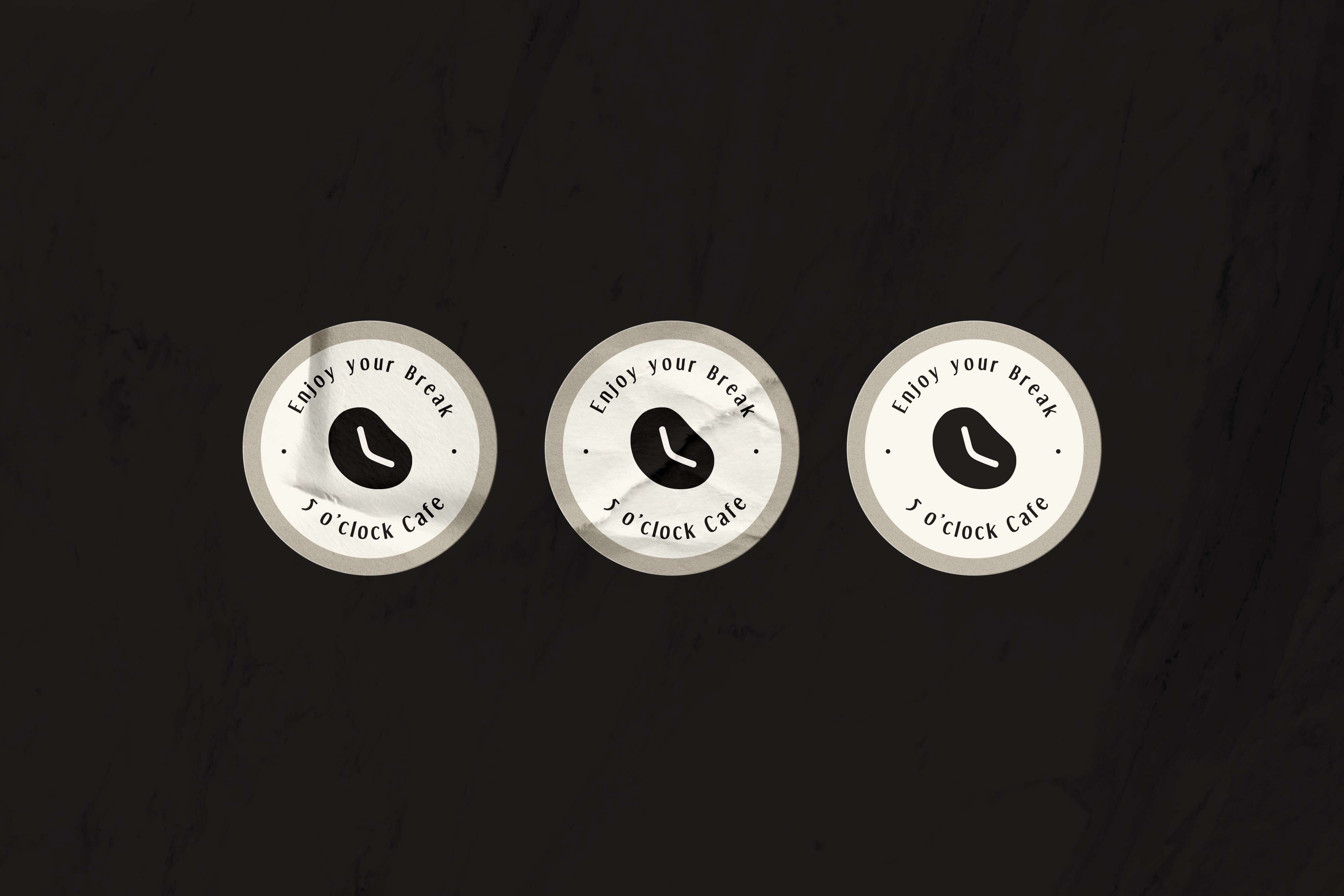
The idea behind 5 o’clock Cafe's logo is a clock in the shape of a coffee bean, with the hands pointing to 5 o’clock. After dozens of initial sketches and brainstorming, I eventually adopted an illustrative outline that could be presented in both dark and light backgrounds.
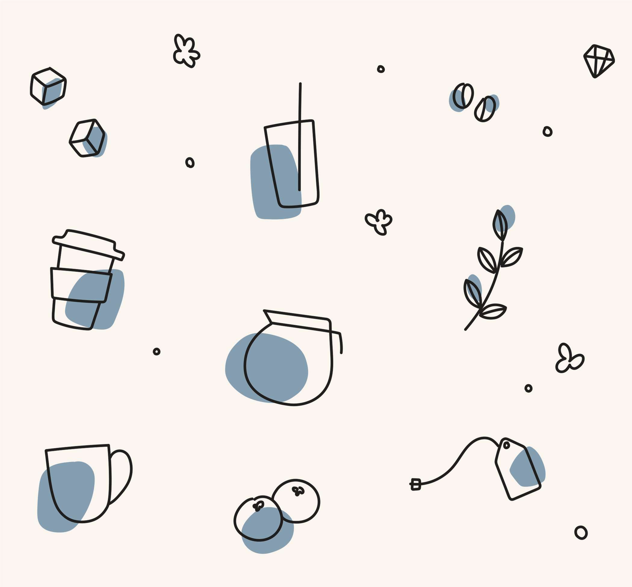
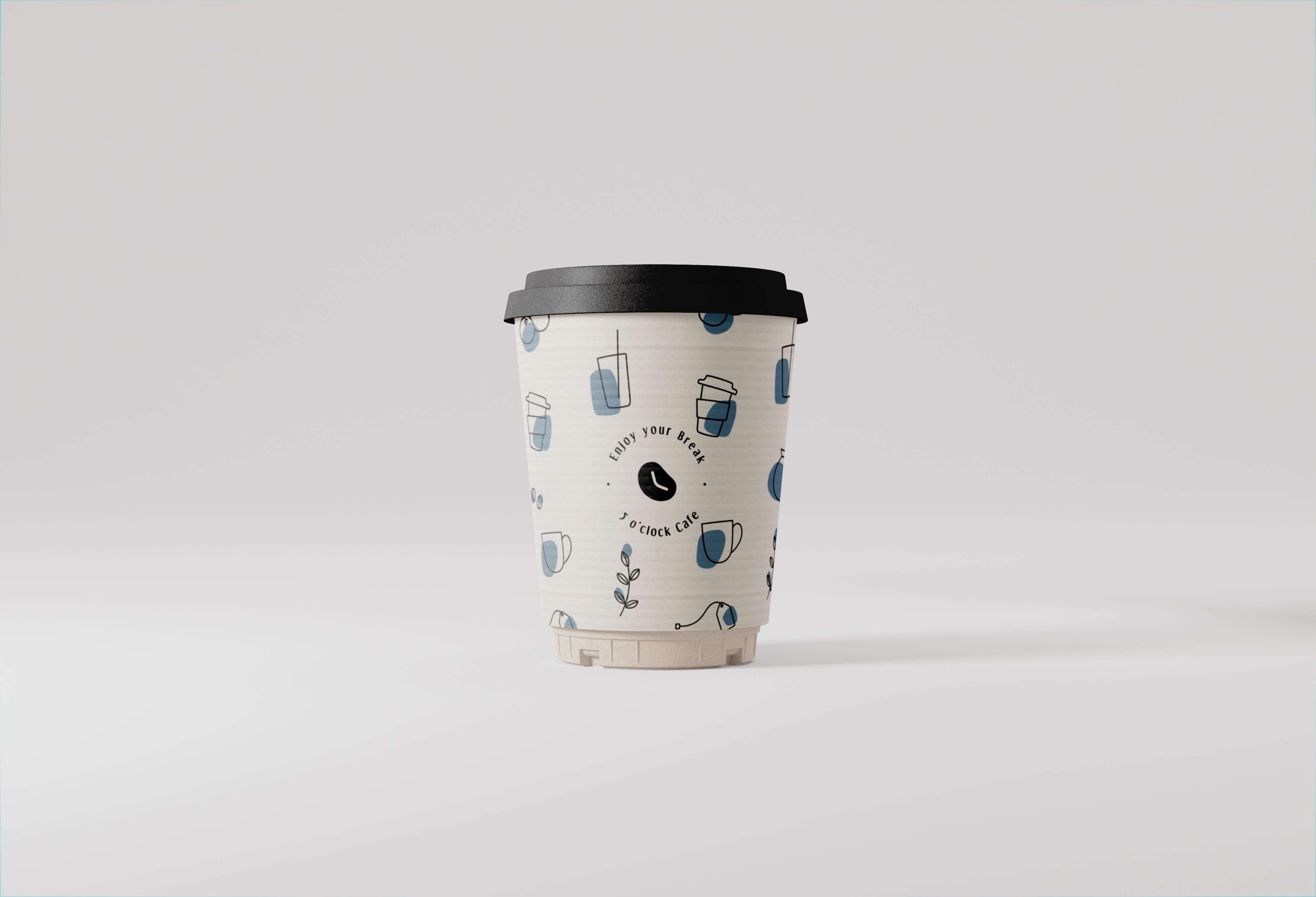
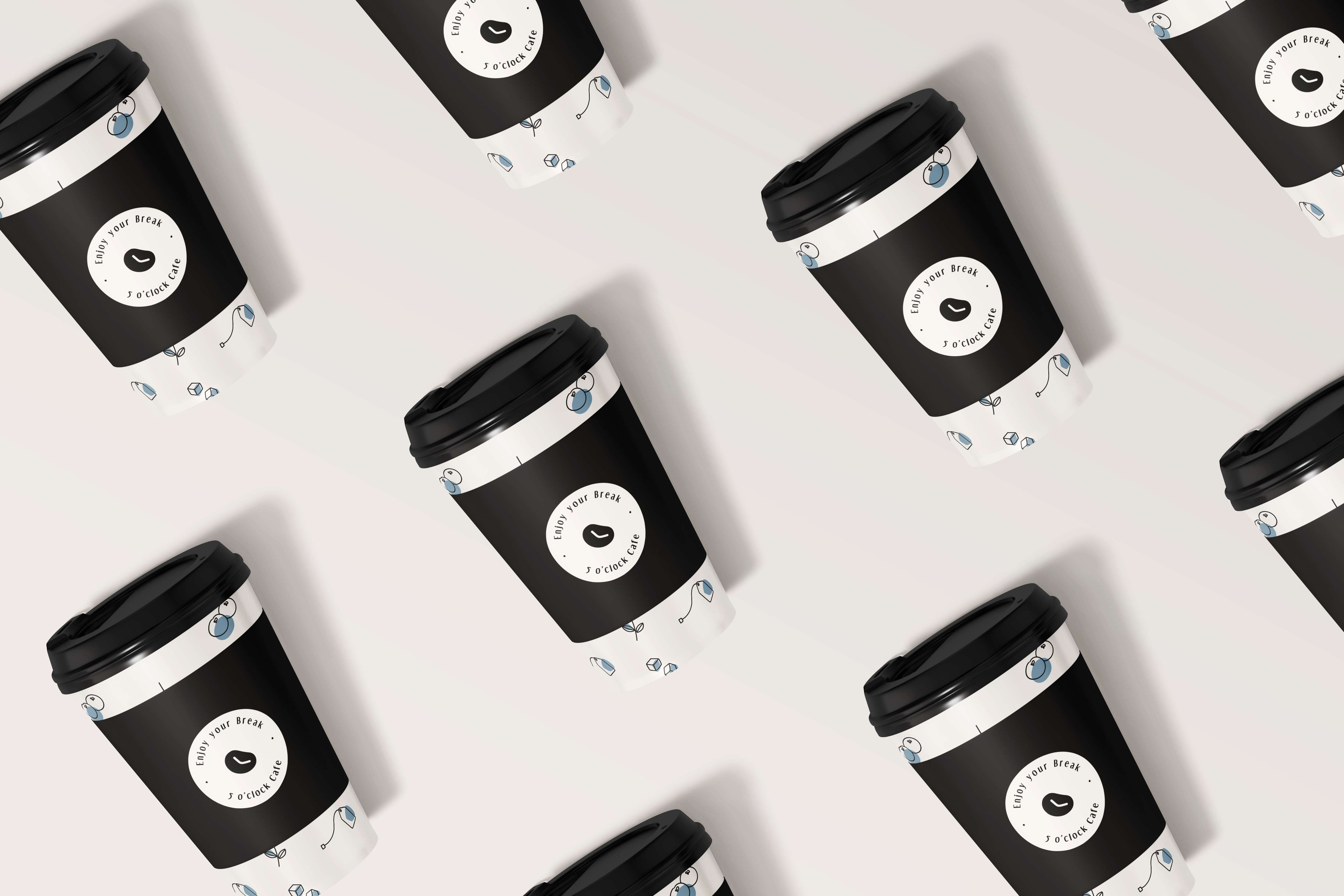
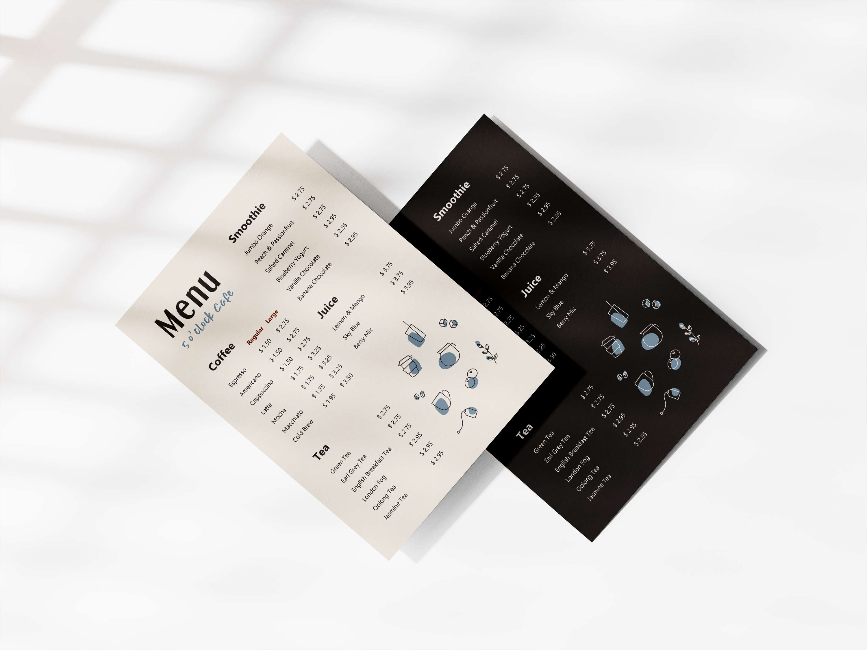
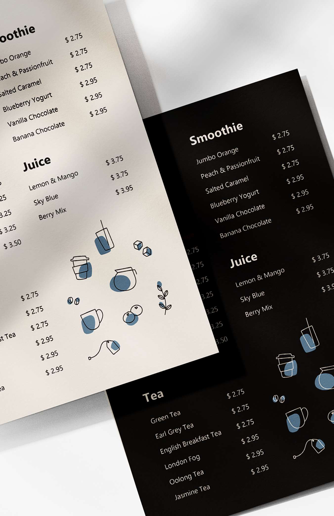
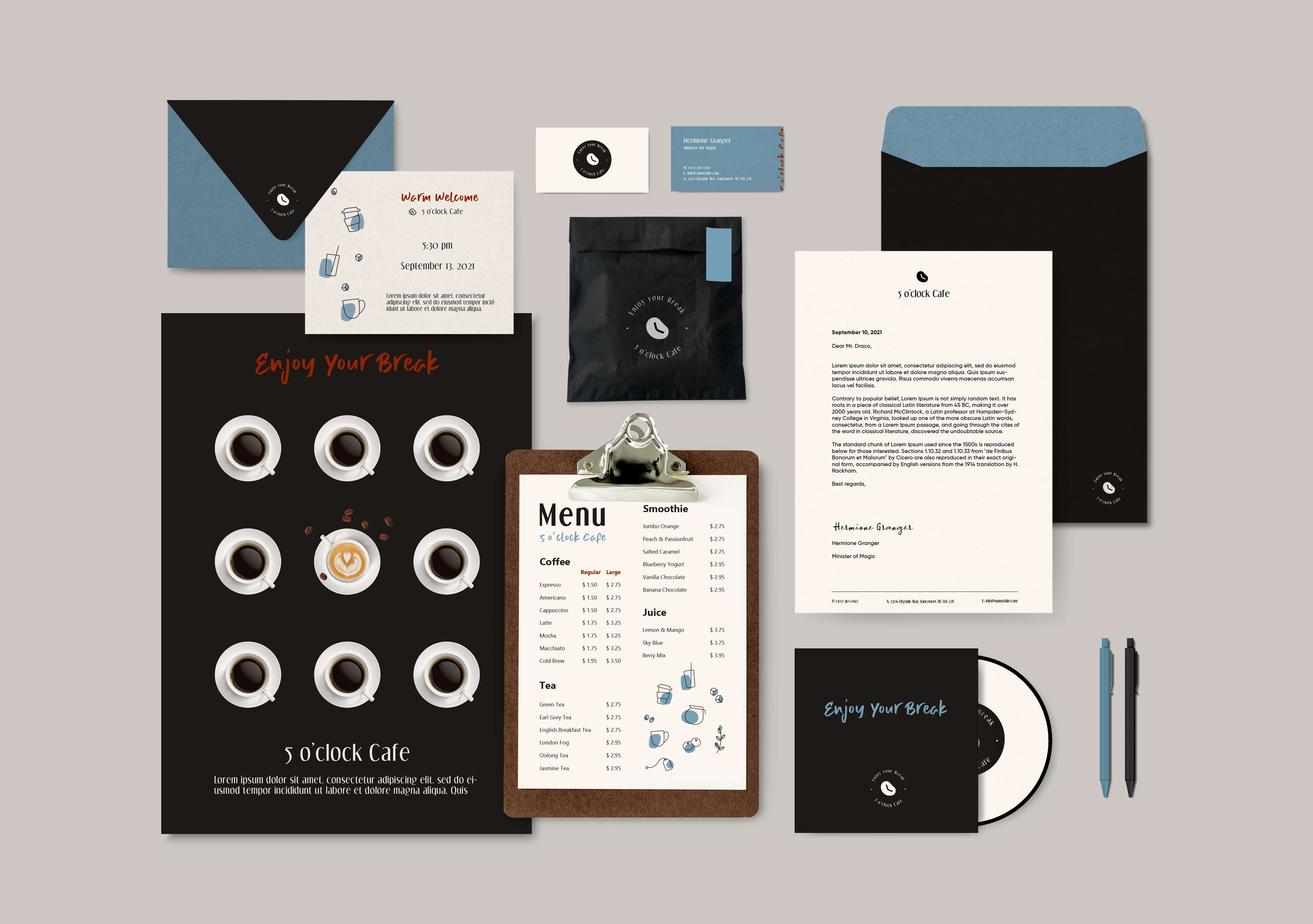
For menu design, I drew illustrations of the drinks to match the menu options. For VI design, I included any common cafe items, such as cups (including to-go cups to cater for pandemic times), menu, paper bags, and stickers.


