Project Type
- Branding
- VI Design
- Illustrations
Tools
- Illustrator
- Photoshop
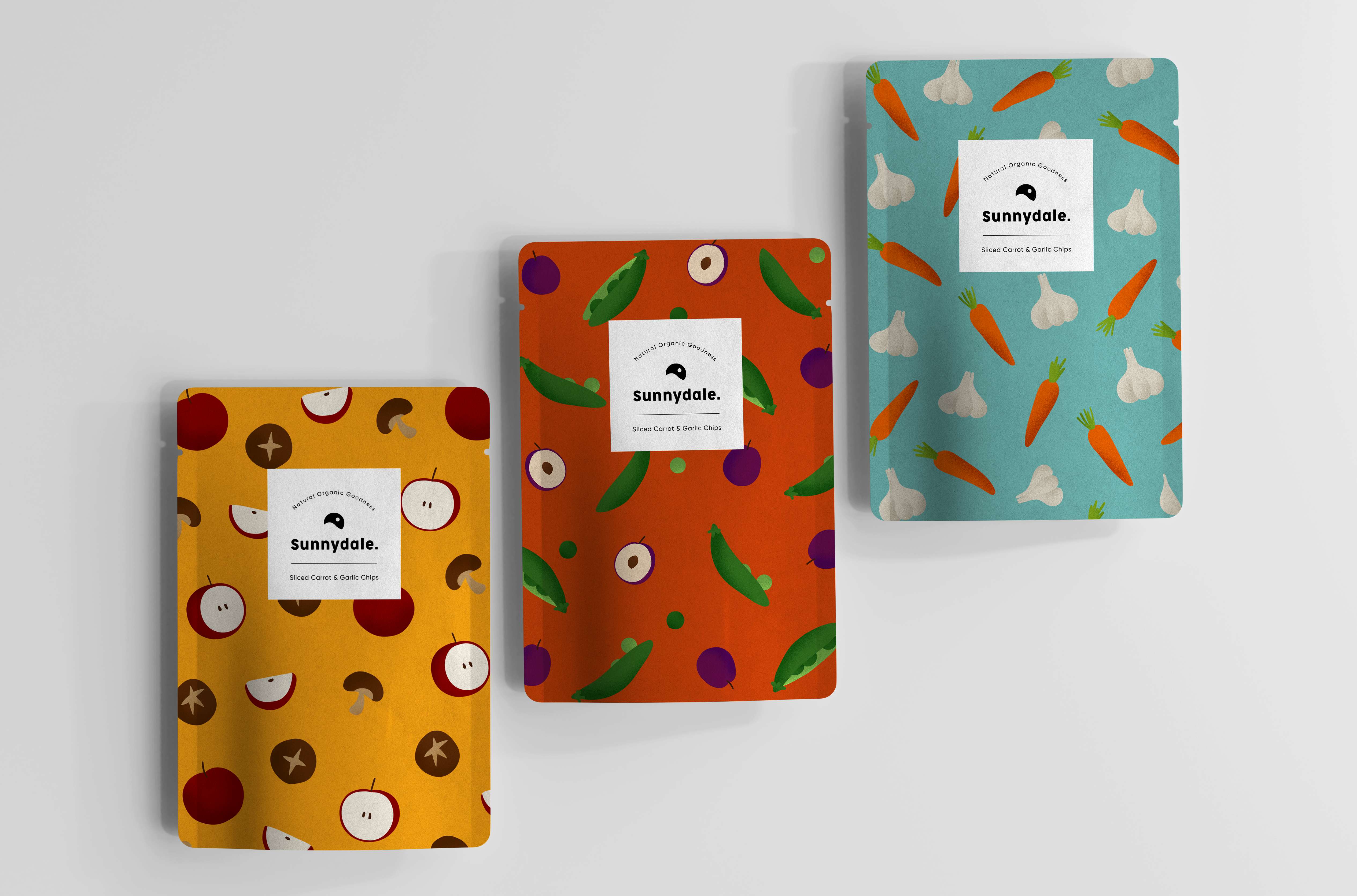
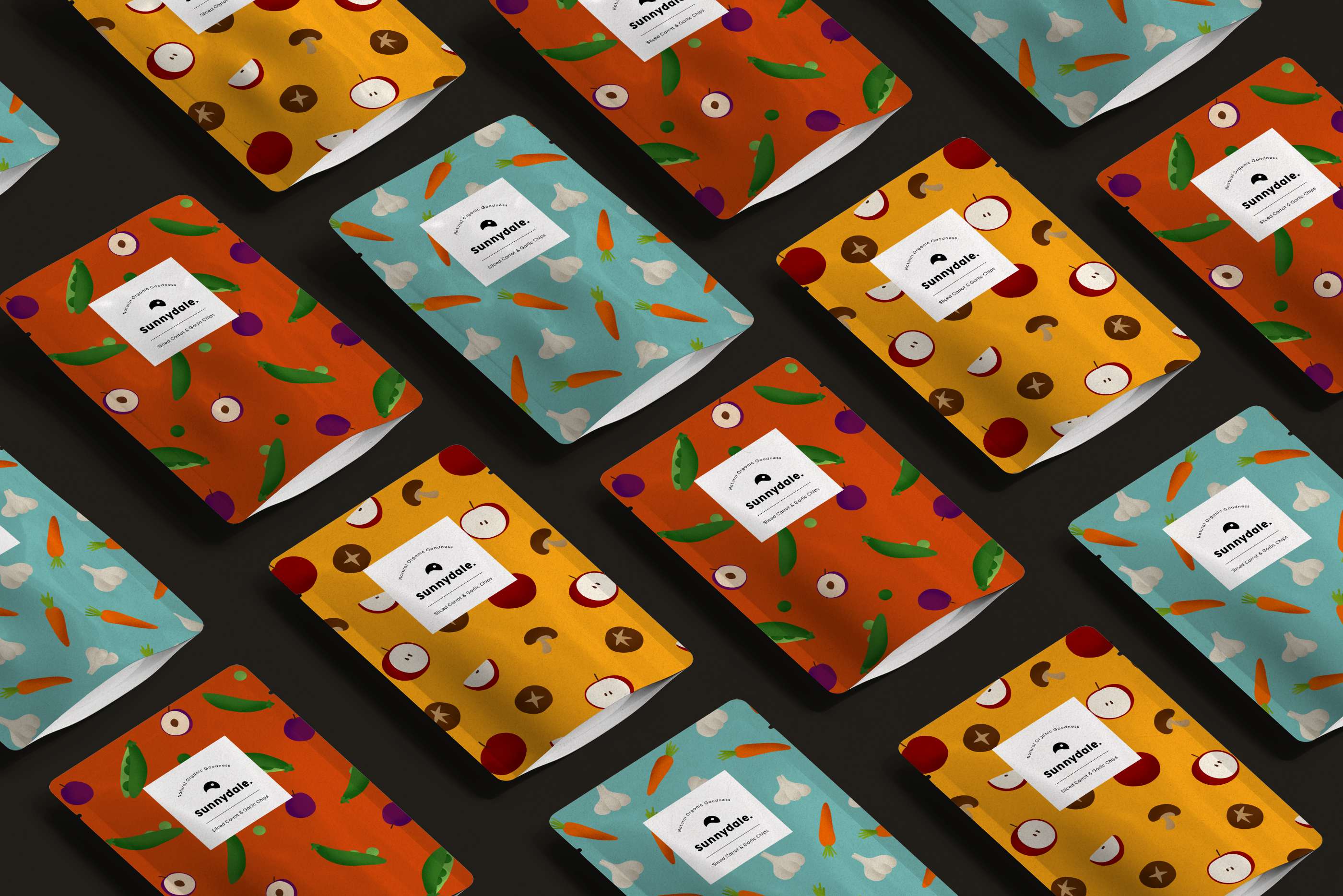
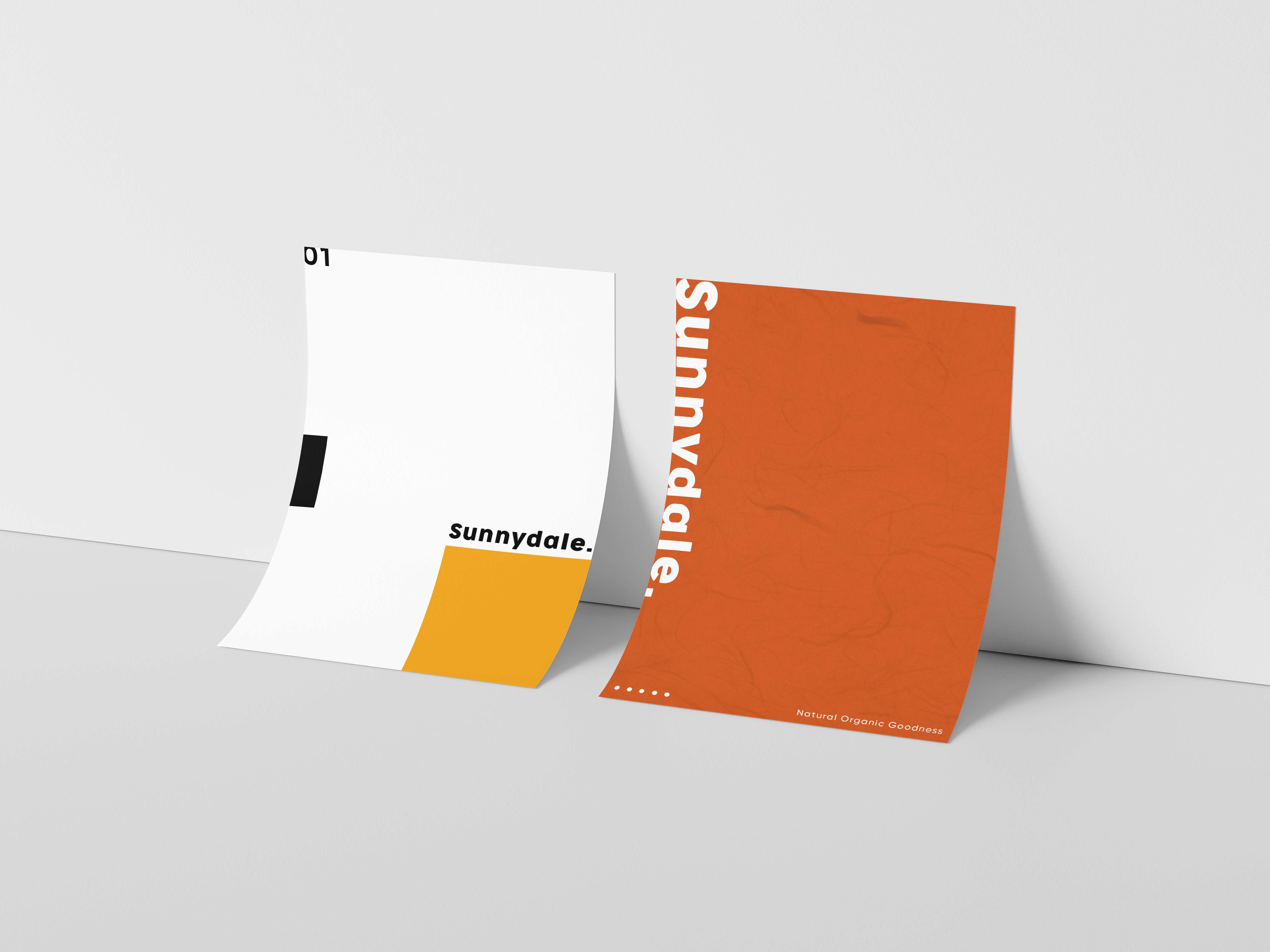
Sunnydale is an all-natural & organic food brand producing environmentally friendly fruit and vegetable chips. The products are oil-free, gluten-free, and vegan. The three main flavors are apple & mushroom, carrot & garlic, and plum & pea.
Before designing, I decided to make my project goal to create a fun illustrative packaging that included 3 types of chips, logo and brand identity design for Sunnydale.
Firstly, I set out to find the target demographic that Sunnydale most likely would attract. I found that adults between 22-35 were most concerned about healthy and organic foods, and were also more likely to try new foods..
Secondly, I decided on the color pallete through user research. According to consumer buying behaviour, consumers are heavily influenced by packaging colors. So my goals for the color pallete was to communicate my product’s purpose, and have customers see the products as fun and novel, and stand out from competitors.
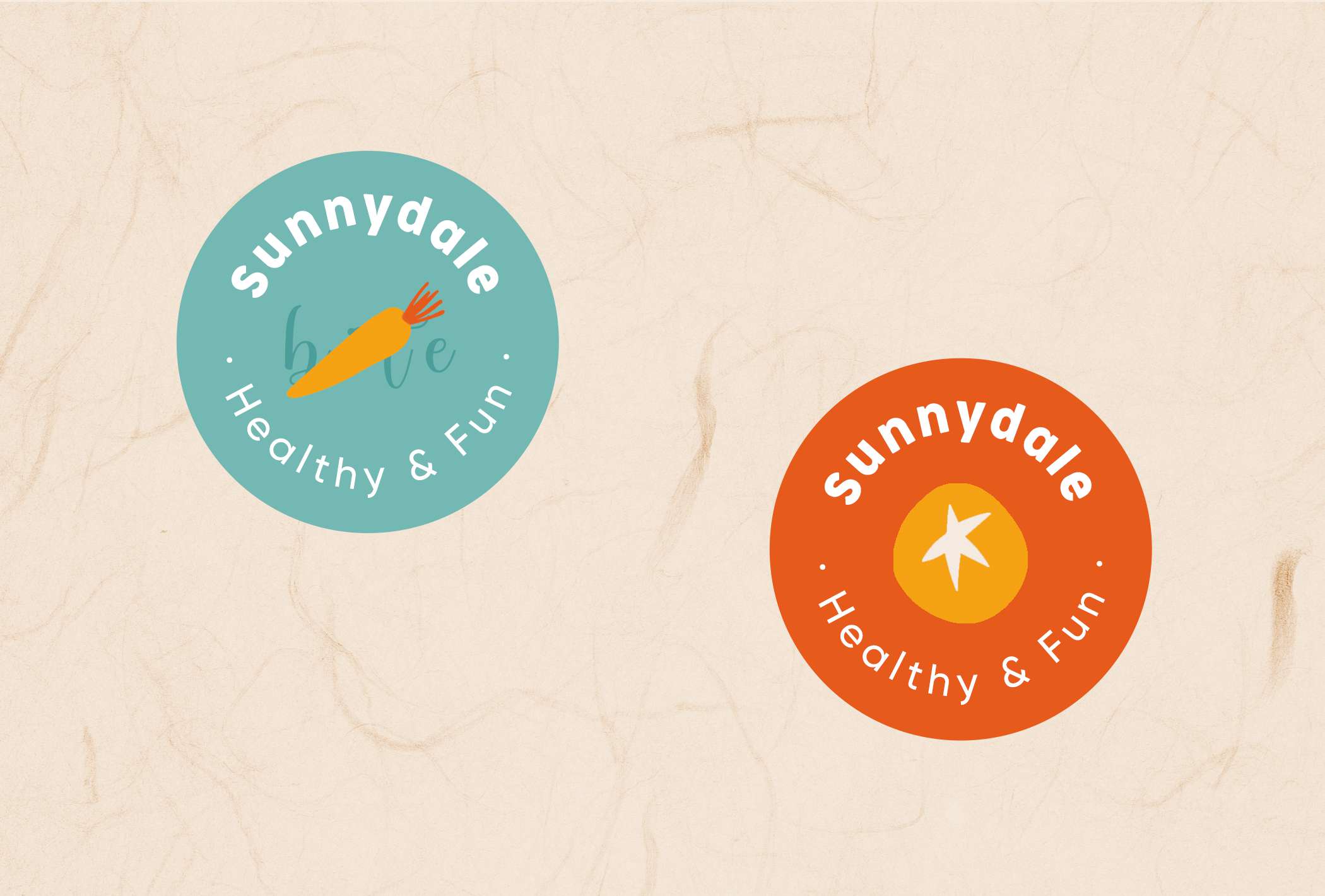
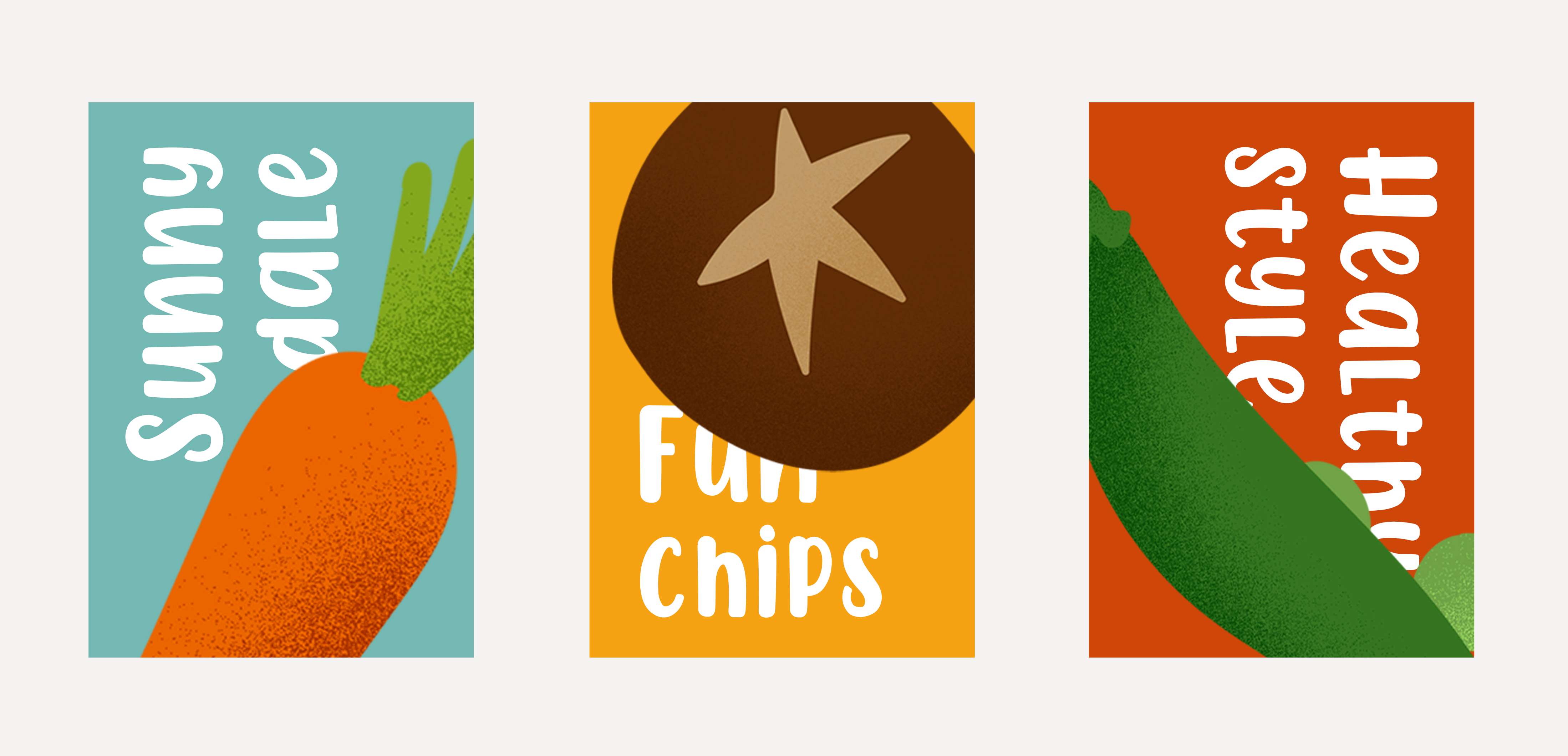
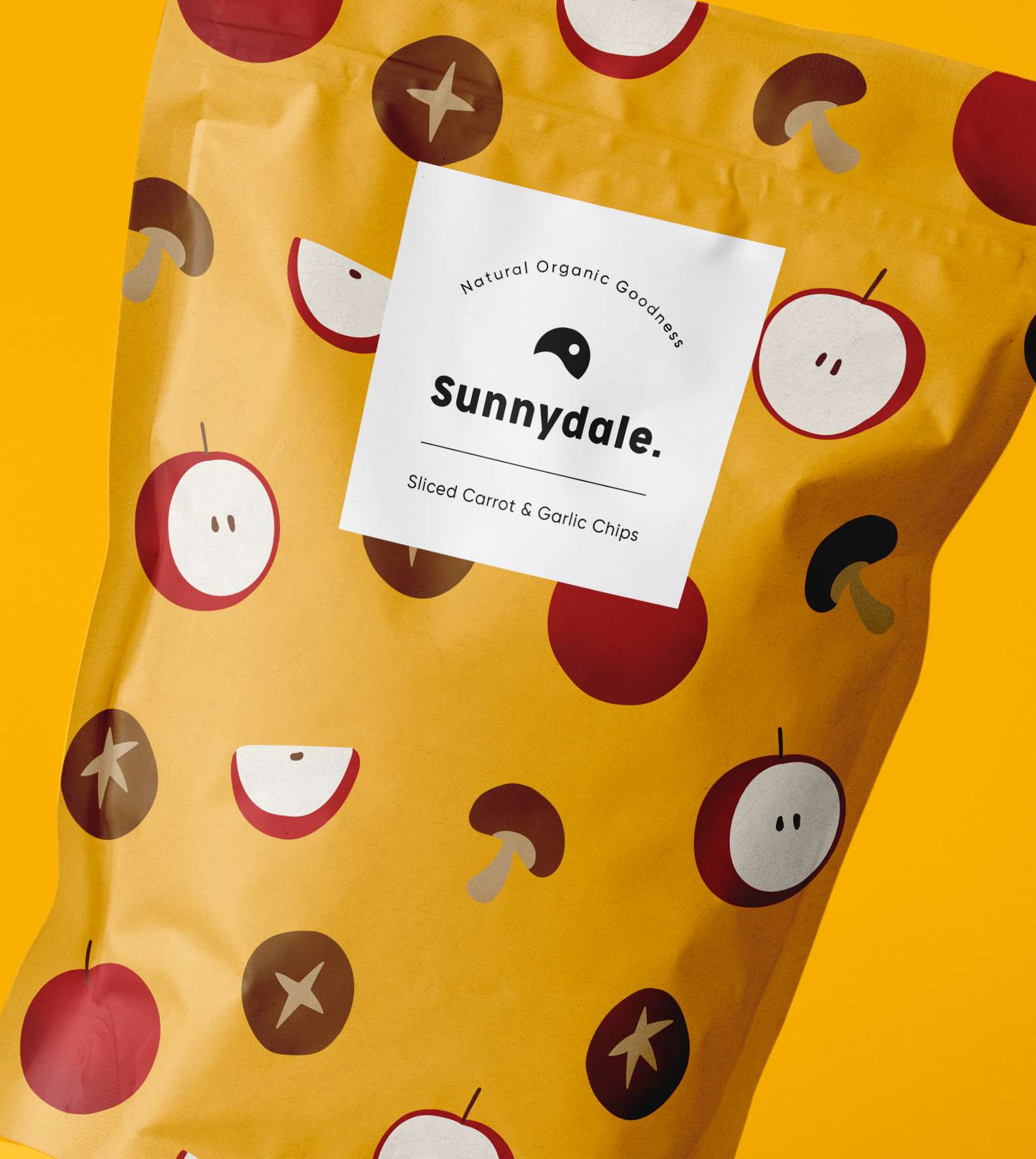
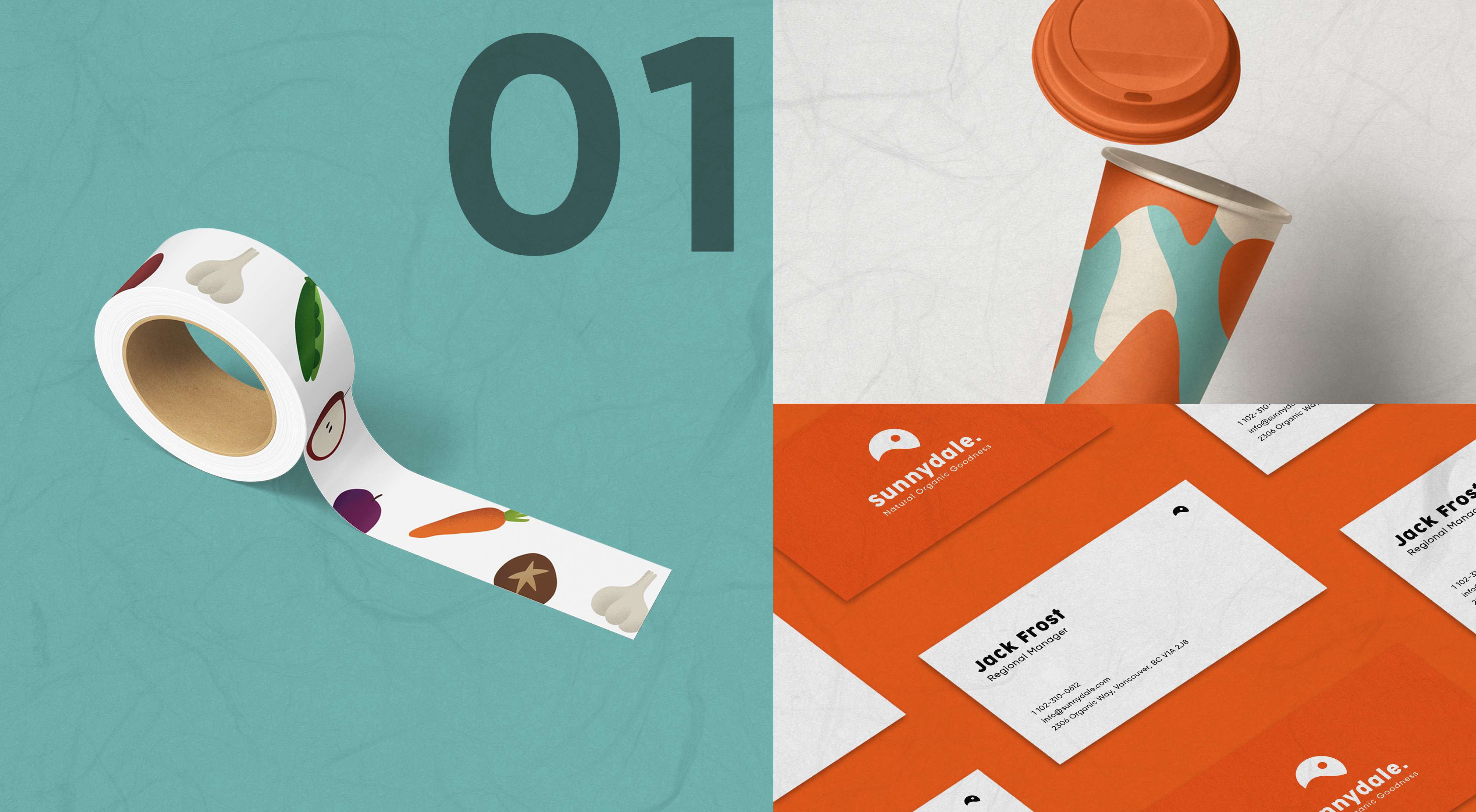
Lastly, I made Illustrations to attract my target demographic. My approach was to directly indicate what was inside the package, to imply transparency and entice curious consumers. I also made sure to be consistent with the color pallete to maintain a perfect balance.
I chose to make the food package a sachet shape, and in the centre I aligned the font, color, and illustration together to form a label.
I then collected feedback through user testing, which deduced that users found my brand to be distinctive from others, and that the illustrations were quite interesting. Users also commented that they would be curious to new flavors based on the likable packaging.

