Project Type
- Web Redesign
- UX/UI Design
- Graphic Design
Tools
- Shopify
- Figma
- Photoshop
- Illustrator
Token Studio Inc. is a designer toys retailer selling a varierty of collectable figurines, blind boxes and toys.
For this project, I teamed up with a web developer in order to fully customize Shopify’s “Expanse” theme from Archetype . We started by meeting with the client to understand the scope of the project, which we deduced to be a combination of web redesign, modernization, and graphic design. The aim was to enhance the visual appearance of the website and improve the user experience while maintaining the website’s original functions and utilities.
Token’s website uses Shopify’s “Expanse” theme, however, the client was not satisfied with the way the themes worked and how it presented itself. From there we analyzed the major flaws of the website and theme, and brainstormed on how of it could be improved. Here are some examples of improvements design-wise:
- Show more brand identity
- Use consistent fonts and ensure readability
- Make photos and banners more consistent with one another.
Prior to the redesign, Token used a brand book, but were open to the idea of changing their logo/font/color. After our discussion with the client, we pinpointed the scope of our work, and decided that the original logo and most of aspects of their brand were something we could work with, and it was possible to build a brand image based on them. And in order to make the website more vibrant, young and comforting, I adopted the following 3 colors as the main colors for their website..
For our font, we tried using “Debussy” from their brand book, but it only had one “Bold” variant, and the font shape was overly round and tight. While it may be a good font for poster/printouts for artistic style titles, it’s hard to read on websites and in turn makes the text on the website clustered. Therefore I decided to use Poppins as the title font.
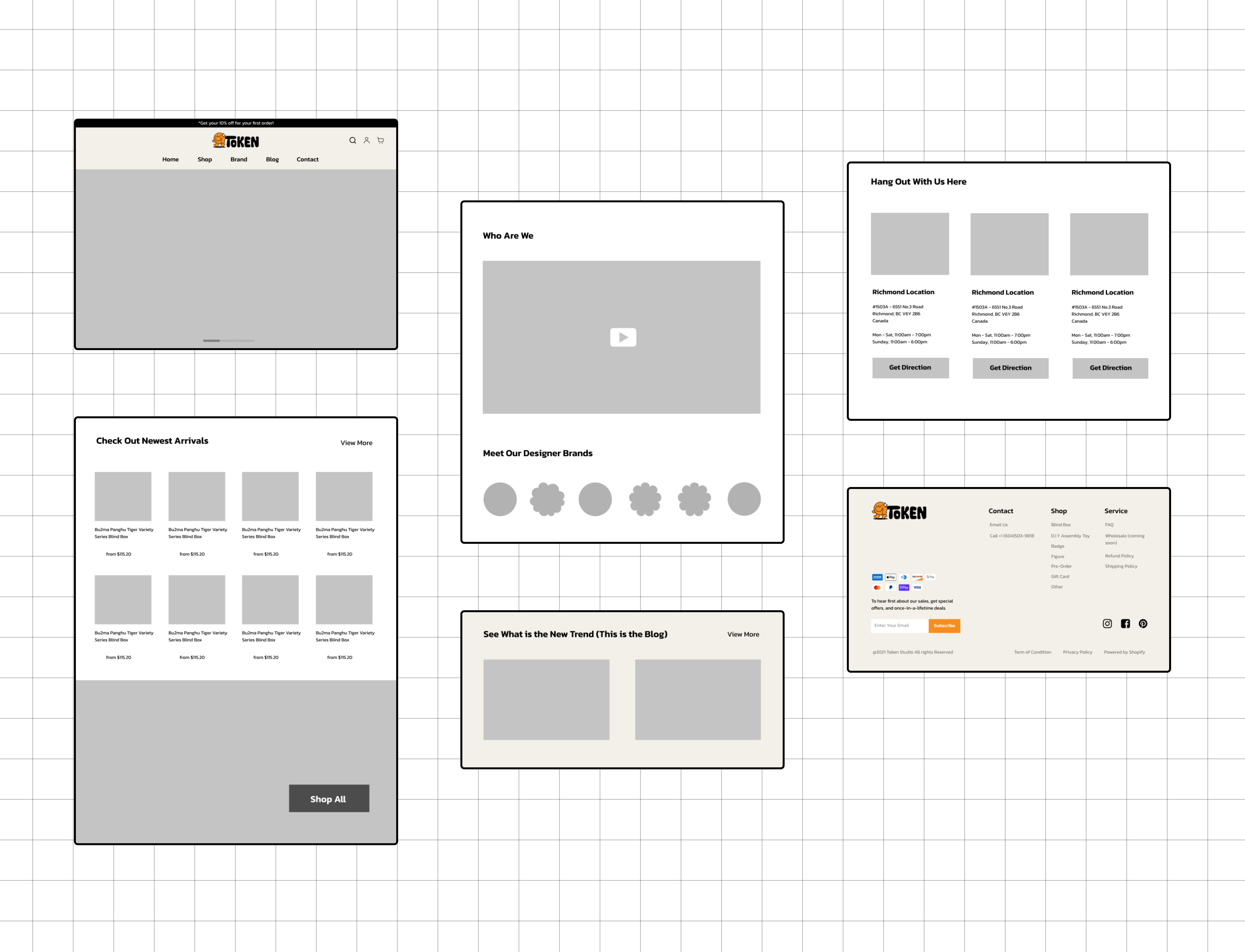
I then created wireframe for the front page with Figma. My examples below include the main sections such as the hero banner, new products, video, categories, blog and contact.
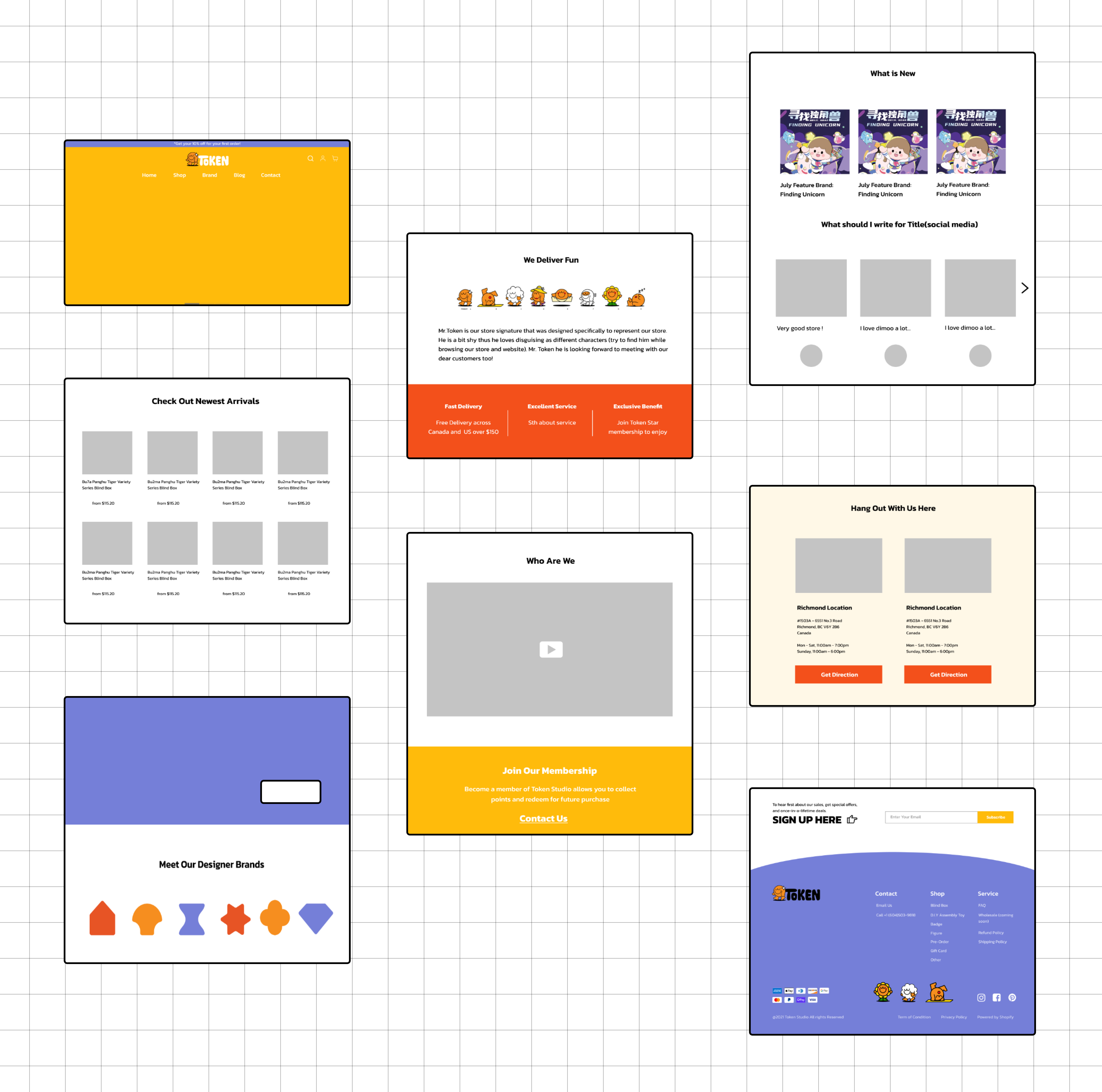
We presented our work so far to the client, and they were satisfied with our wireframes. Although they mentioned they liked the layout of another theme on Shopify, “Fresh”. They found that “Fresh” presented products in a way they liked, so I worked to improve a few sections and added the likeness of “Fresh” into our design. I did this by adding a variety of shapes and colors for different brands, along with fun visuals about the company, and a subscribe section seperated from the footer.
Next up, I implemented the details for each section with the help of the web developer, including cropping out product images, and creating graphics and icons. The following banners are examples of graphics I designed for their website.
View final website.


